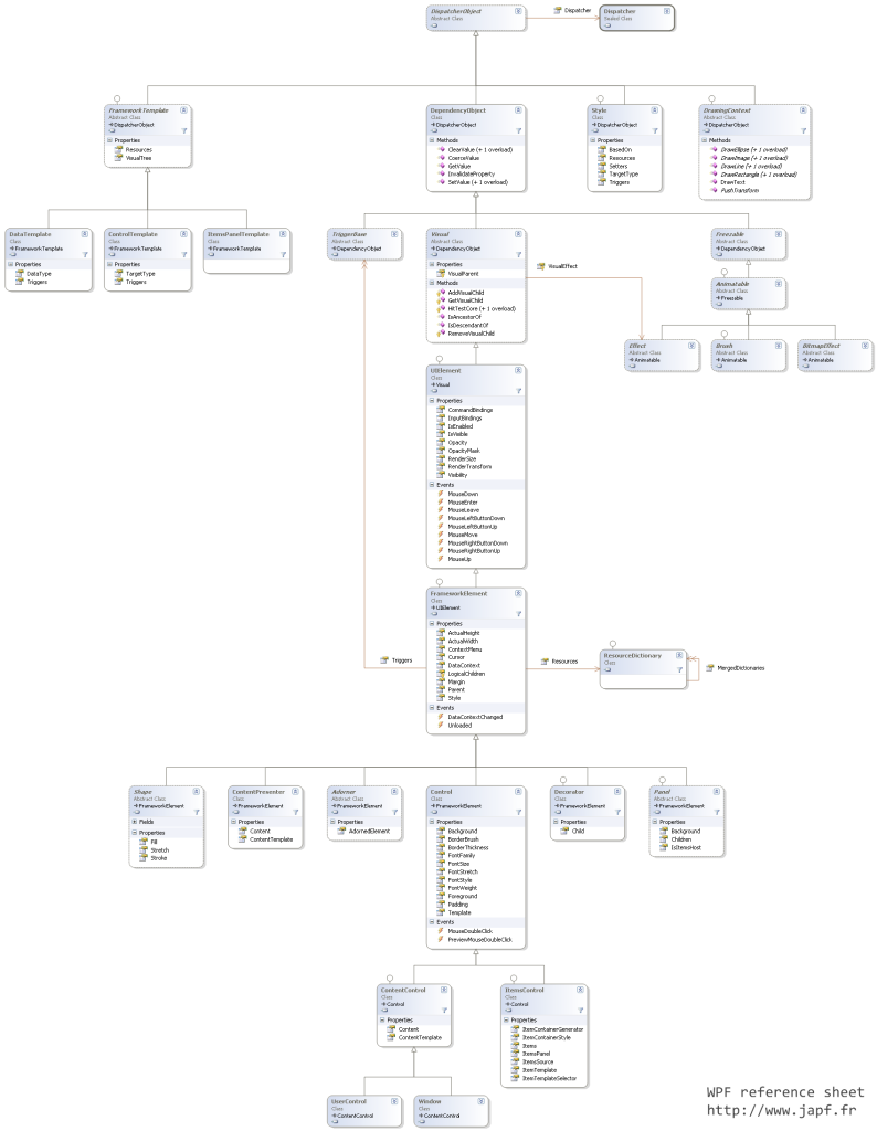
In this first article, I’d like to make a tour of the core WPF classes and how they are related.
Knowing the organization of WPF classes is important when we create a new control because we have to determine which base class we’re going to use. It is also interesting to know how the framework has been designed. That’s the goal of this first article.
Here is an image of the core WPF classes and how they are related (click for larger resolution):
The diagram is voluntary simple above the Control classes because that will be targeted by another article.
- represents an object that is associated with a Dispatcher
- can be accessed from a thread other than the thread the DispatcherObject was created on, using Invoke or BeginInvoke calls
- can enforce thread safety by calling VerifyAccess
- cannot be independently instantiated; that is, all constructors are protected
From the DispatcherObject class, we have 4 new classes (one more time, this is a partial view of what really is in the framework):
- the FrameworkTemplate abstract class, the base class for WPF DataTemplate, ControlTemplate and ItemsPanelTemplate templates. The FrameworkTemplate abstract class has a VisualTree property (of type FrameworkElementFactory) to support the creation of the content of the template.
- the Style class that has a collection of Setters and Triggers that triggers a given TargetType and can be BasedOn an existing resource
- the DrawingContext class that populates a Visual or a Drawing with visual content. DrawingContext used with a retained mode graphics system (more information here)
- and the DependencyObject class,
The DependencyObject class:
- contains the mechanism to deal with Dependency Properties through a set of methods such as ClearValue, SetValue and GetValue
- is inherited by 3 new classes
- TriggerBase, for specifying a conditional value within a Style object. Inherited by DataTrigger, EventTrigger…
- Freezable, for object that has a modifiable state and a read-only (frozen) state. Classes that derive from Freezable provide detailed change notification, can be made immutable, and can clone themselves
- and the Visual class,
The Visual class:
- provides rendering support in WPF, which includes hit testing, coordinate transformation, and bounding box calculations
- is the first class supporting the VisualParent property that helps setting up the visual tree
- support methods for adding, removing and getting visual child (through the IAddChild interface)
- has an VisualEffect property of type Effect (from Animatable / Freezable)
- is inherited by the UIElement class,
The UIElement class:
- can render as a child element
- contains logic that is used to size and position possible child elements of a UIElement (when interpreted by a layout system)
- can respond to user input (including control of where input is getting sent to via their handling of event routing, or routing of commands)
- can raise routed events that travel a route through the logical element tree
- supports some aspects of the animation system
- is enhanced by the FrameworkElement class,
The FrameworkElement class extends the UIElement class by adding the following functionalities:
- layout system definition using the ArrangeOverride method
- logical tree with the Parent property
- object lifetime events such as Initialized, Loaded, Unloaded
- support for databinding (DataContext property) and resources management (Resources property)
- support styles (Style property)
- does not handle the Template feature implemented in the Control class
Several classes inherit the FrameworkElement class:
- the Shape abstract base class for Rectangle, Ellipse and Polygon classes
- the ContentPresenter class to mark where the content should be added when writing ControlTemplate
- the Adorner class to decorates UIElement
- the Decorator base class, for elements that apply effects onto or around a single child element (such as Border or Viewbox)
- the Panel class to position and arrange child objects
- and the Control class
The Control class:
- is the base class for WPF controls that use a ControlTemplate to define their appearance (through the Template property)
- defines a set of UI properties (that can be exploited by ControlTemplates): Background, BorderBrush, BorderThickness, FontFamily, FontSize, FontStrech, FontStyle, FontWeight, Foreground and Padding
- support mouse double clicks event using MouseDoubleClick and PreviewMouseDoubleClick
In order to show where most of the WPF controls are (but that will be the object of another article), I also added ContentControl, ItemsControl, UserControl and Window class to the diagram.

Very interesting story, thank you !