Tag Archives: controls

Introducing the PivotIndicator control for Windows Phone

Update: source code is now available on GitHub.

Today I would like to share a nice control which is part of my mysterious Windows Phone 7 app which will be released later this month. I call this control the PivotIndicator control. It can be used in order to show the user all the items in a PivotControl on a single screen, as shortcuts. A small rectangle (which use the phone’s accent color as background) is animated when the current pivot item changes. The user can press any item to immediately go to the associated pivot item.

You can grab the source code here.

Here is a short video showing the control in action:

[mediaplayer src=’/wp-content/uploads/PivotIndicator.wmv’ width=432 height=808 ]

Now let’s see the details…

  • How to use it?
  1. Adjust the layout of your page to be able to display the PivotIndicator. Typically this involves adding a row with a ‘*’ height.
  2. Use a binding with an ElementName in order to set the Pivot property of the PivotIndicator control
  3. Define the HeaderTemplate property of the PivotIndicator with a DataTemplate which will be used to render each item in the PivotIndicator
  4. You’re done 🙂
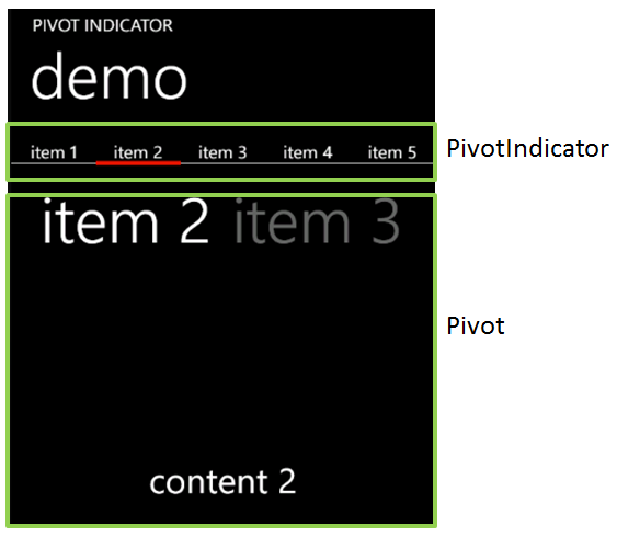
Here is what is looks like in the demo:


  • How it works?
Behind the scene, the PivotIndicator control is actually made of 3 parts:
  • SplitPanel: this is a panel (it derives from Panel) which arrange its children on a single line, and where each item has the same width. The width is computed as the total available width divided by the number of items
  • PivotRectange: this is a small control which contains a rectangle. The rectangle uses the phone’s accent color. Its position is animated based on the currently selected index.
  • PivotIndicator: is the control you will use. It is made of an ItemsControl with a SplitPanel as ItemsPanelTemplate and the PivotRectangle
Source code is documented so you might want to dig in it for more details 🙂
Note that I didn’t try but I think the PivotIndicator control should works just fine with a Panorama (and few code adjustments…)

Introducing the ContentSlider control

In my very first article, I wrote an article about an implementation of a solution allowing to use transition (using a sliding effect) between views in a WPF application.

As a reminder, here when I talk about “views” I mean a screen of the application. One of this screen could be used as a login screen, the other one to setup parameters, etc.

In this article, I introduce a CustomControl that I build in order to re-use the implementation I described in an easy way. Basically, using this control, you can write something like:


All the specific stuff related to the transition (the animation, the use of a VisualBrush…) is handled INSIDE the control so that it is completely transparent to use.

From C# code point of view, you’ll need to use 3 functions:

  • PrepareSlide()
  • SlideToLeft()
  • SlideToRight()

The first one (PrepareSlide) must be called right before changing the content of the view. It will create a “snapshot” of the view so that it will become possible to animate it.

The next two one should be called to slide the content to the left (or to the right).

I hope you’ll enjoy it. Here is a solution containing the control with example.