Category Archives: Windows Phone

MVVM framework explorer updated !

After several requests, I finally took the time to update my MVVM Explorer Silverlight App !

Here is the changelog:

  • update all download stats (based ONLY on CodePlex stats)
  • refresh popularities
  • remove StructuredMVVM (not available on CodePlex)
  • add WinRT support (however, no toolkit seems to support if official yet)
Top 5 (most downloaded & supporting WPF, Silverlight and Windows Phone):
  1. MVVM Light (95k downloads)
  2. Caliburn Micro (27k downloads)
  3. nRoute (22k downloads)
  4. Simple MVVM toolkit (10k downloads)
  5. Catel (8k downloads)

As always, feedbacks are welcome !

WP7 performance tip: translate transforms

In my previous blog post, I described a control called the PivotIndicator.
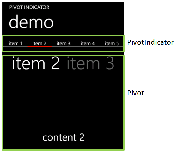
The PivotIndicator is made of a small rectangle that is animated on an X axis: its position is updated every time the selected item of the Pivot changes. Here is the code which setup this animation:

var border = new Border { /* init properties... */ };
var animation = new DoubleAnimation
{
    Duration = new Duration(TimeSpan.FromSeconds(0.5)),
};

Storyboard.SetTarget(this.animation, this.border);
Storyboard.SetTargetProperty(this.animation, new PropertyPath(Canvas.LeftProperty));

The problem I noticed was that this animation wasn’t fluid. In particular, when the PivotItem contains a lot of items…

As you probably already know, the WP7 platform introduces a Compositor thread. This thread does not exist in the “desktop” version of Silverlight. The idea is that this thread can handle simple animations independently from the UI thread (which can be quite busy…) and leverage the GPU.

Now, in my code, I’m using a DoubleAnimation to animate a Canvas.Left property. What is wrong with that ? Actually, the problem is the property I’m animating, not the animation itself. When I setup an animation using Canvas.Left, there is absolutely no way the Compositor thread can handle it. Why ?

Because when the property changes, it triggers a layout update in the Canvas. This process is totally “CPU-bound” and executes on the UI thread. The dependency property changes, it calls InvalidateLayout which update the position of the item (by calling .Arrange() on each of its child). In this case, the GPU & the compositor thread cannot be used.

Now, the trick is to do the exact same animation with a different code:

var border = new Border { /* init properties... */ };
var translateTransform = new TranslateTransform();
border.RenderTransform = translateTransform;
var animation = new DoubleAnimation
{
    Duration = new Duration(TimeSpan.FromSeconds(0.5)),
};

Storyboard.SetTarget(this.animation, translateTransform);
Storyboard.SetTargetProperty(this.animation, new PropertyPath(TranslateTransform.XProperty));

Notice that all I change is using an TranslateTransform: the target of the animation is not the border but the translate transform it self. A TranslateTransform is an operation which can be handled by the GPU. Now, his animation is handled by the Compositor Thread and will be fluid even though the UI thread gets very busy !

Hope it helps 🙂


Introducing the PivotIndicator control for Windows Phone

Update: source code is now available on GitHub.

Today I would like to share a nice control which is part of my mysterious Windows Phone 7 app which will be released later this month. I call this control the PivotIndicator control. It can be used in order to show the user all the items in a PivotControl on a single screen, as shortcuts. A small rectangle (which use the phone’s accent color as background) is animated when the current pivot item changes. The user can press any item to immediately go to the associated pivot item.

You can grab the source code here.

Here is a short video showing the control in action:

[mediaplayer src=’/wp-content/uploads/PivotIndicator.wmv’ width=432 height=808 ]

Now let’s see the details…

  • How to use it?
  1. Adjust the layout of your page to be able to display the PivotIndicator. Typically this involves adding a row with a ‘*’ height.
  2. Use a binding with an ElementName in order to set the Pivot property of the PivotIndicator control
  3. Define the HeaderTemplate property of the PivotIndicator with a DataTemplate which will be used to render each item in the PivotIndicator
  4. You’re done 🙂
Here is what is looks like in the demo:


  • How it works?
Behind the scene, the PivotIndicator control is actually made of 3 parts:
  • SplitPanel: this is a panel (it derives from Panel) which arrange its children on a single line, and where each item has the same width. The width is computed as the total available width divided by the number of items
  • PivotRectange: this is a small control which contains a rectangle. The rectangle uses the phone’s accent color. Its position is animated based on the currently selected index.
  • PivotIndicator: is the control you will use. It is made of an ItemsControl with a SplitPanel as ItemsPanelTemplate and the PivotRectangle
Source code is documented so you might want to dig in it for more details 🙂
Note that I didn’t try but I think the PivotIndicator control should works just fine with a Panorama (and few code adjustments…)